Describe basic results. Begin the analysis with what is easy to understand rather than hard. First describe the data overall, for example a paper that says the study:
“… generated 54 raw data files (3 sets with 18 groups), giving 1,512 result records (12 questions by 18 groups for 7 vote sets), each involving five people in 2 decisions (vote and confidence). There were 12 missing values (one person missed a third vote) so some ANOVA calculations involved only 17 groups. The complete experiment involved over 15,000 individual vote decisions. Of the 4320 first and second votes, only 89 (or 2.1%) were Don’t know.” Generating Agreement in Computer-mediated Groups, p13.
Describe the sample. Next describe the sample demographics, e. g. males vs. females, age etc. and compare with the population of interest to show how the sample represents the population. Even if the sample is only one person, answer the question “Was that person typical?” Giving subject demographics indicates what group the research applies to. Students don’t always represent the general population but one can argue that they do:
“The subjects were 28 students enrolled in an undergraduate Management Information Systems evening course, with 65% males and 35% females. They were a culturally diverse group, and most also worked full time. Subjects on average had used browsers for 7.75 years, and spent over 26 hours per week using them, so were experienced browser users.” Expanding the Criteria for Evaluating Socio-Technical Software, p 10.
Compare sample demographics to the research population.
Describe single construct results. Describe single construct results before moving on to interactions, based on data type:
- Qualitative: Describe the themes found with selected text quotes.
- Quantitative: Quantitative results can be described by just three numbers:
1. Frequency. The number of values.
2. Central tendency. The data center point.
3. Dispersion. The data spread.
Again these depend on data type:
- Categorical. Break down the number in each category in a frequency table with percentages that add to 100%. The center point is the mode – the most frequent category. Dispersion doesn’t apply to category data.
- Ordinal. For number again use a frequency table. The center point is the median – the middle rank if you lay all the points out in a line. The dispersion is the range, the minimum-maximum difference.
- Interval. Interval scores can be summarized by three descriptive numbers: frequency N, mean µ, and standard deviation σ.
Use tables and graphs to describe data depending on type, or simply state the results in the text.
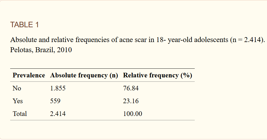
Frequency tables. A frequency table shows numbers and/or percentages that show the frequency distribution of one or more variables. All tables need a table number and a title at the top. Tables must be referenced in the main text, e. g. “See Table 1”. The example shows the frequency of acne in 2,414 subjects as a frequency and a percentage. Give tables a meaningful title, e. g. “Usage by Experience” not a meaningless title like “Data results”. Row and column labels should clearly describe what the rows and columns are. If you present a table, be sure to comment on what it means in the text.Tables need a useful title, row/column labels and a description in the text.
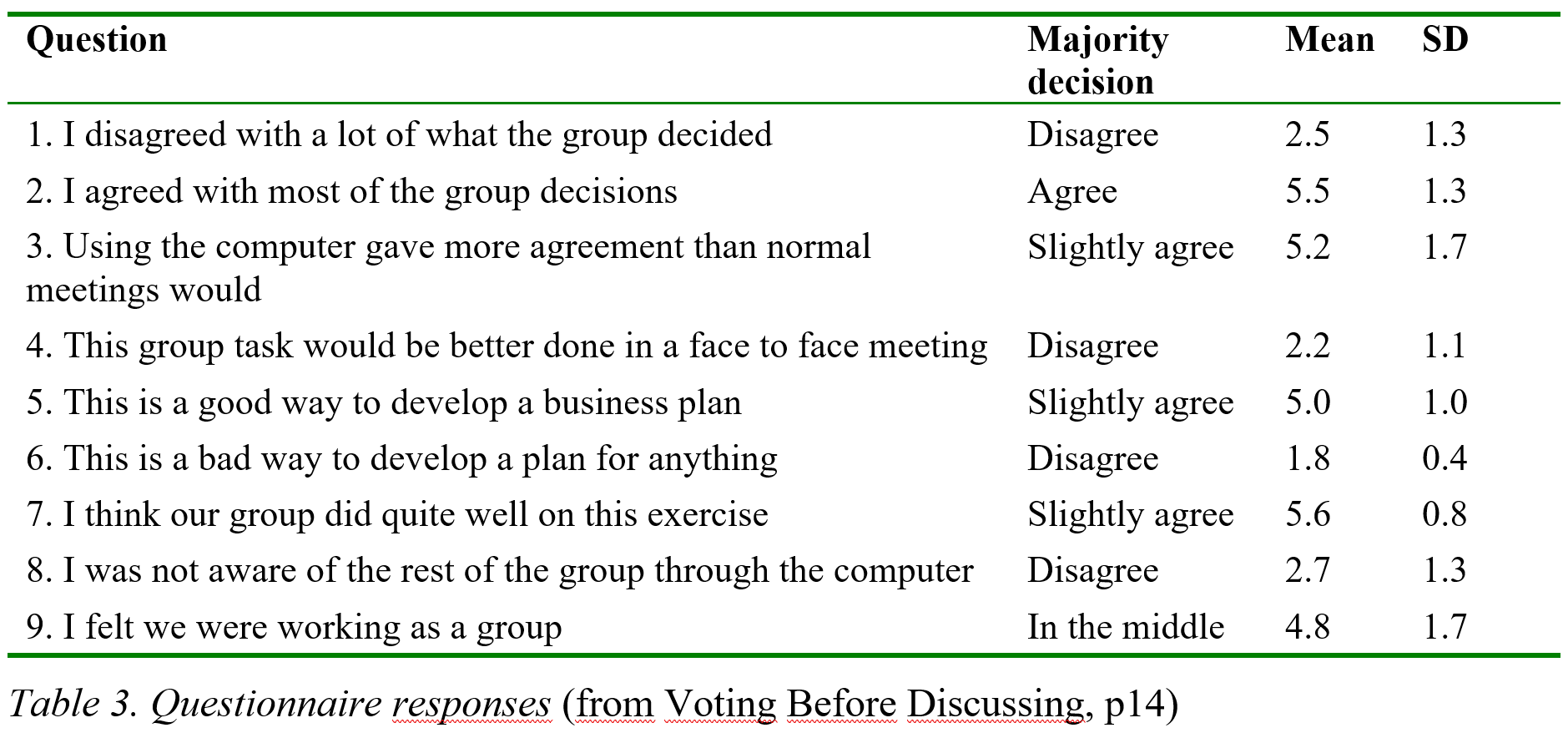
Result tables. Result tables give results like mean and standard deviation broken down by one or more variables. The table shown does this for a 1-7 response scale for nine questions and also gives the majority decision for clarity. In the table, round off data appropriately to the error, e. g. if the data is accurate to two decimal places, give 3.74 not 3.742356, even if the statistics package gives 3.742356. Round off data in result tables appropriately to the error.
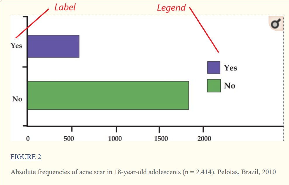
Graphs. Graphs present numeric data in picture form. For example, the acne study results given earlier can be presented as a histogram, a frequency table in picture form. Like tables, graphs need a figure number and a relevant title that is referred to in the text, except the title now appears below the figure. They also have labels to describe what each value represents, or a floating legend to do the same.
If there are more than two values, the histogram usually shows them along a horizontal axis. The vertical axis is the frequency, i.e. the number of times that score occurred.
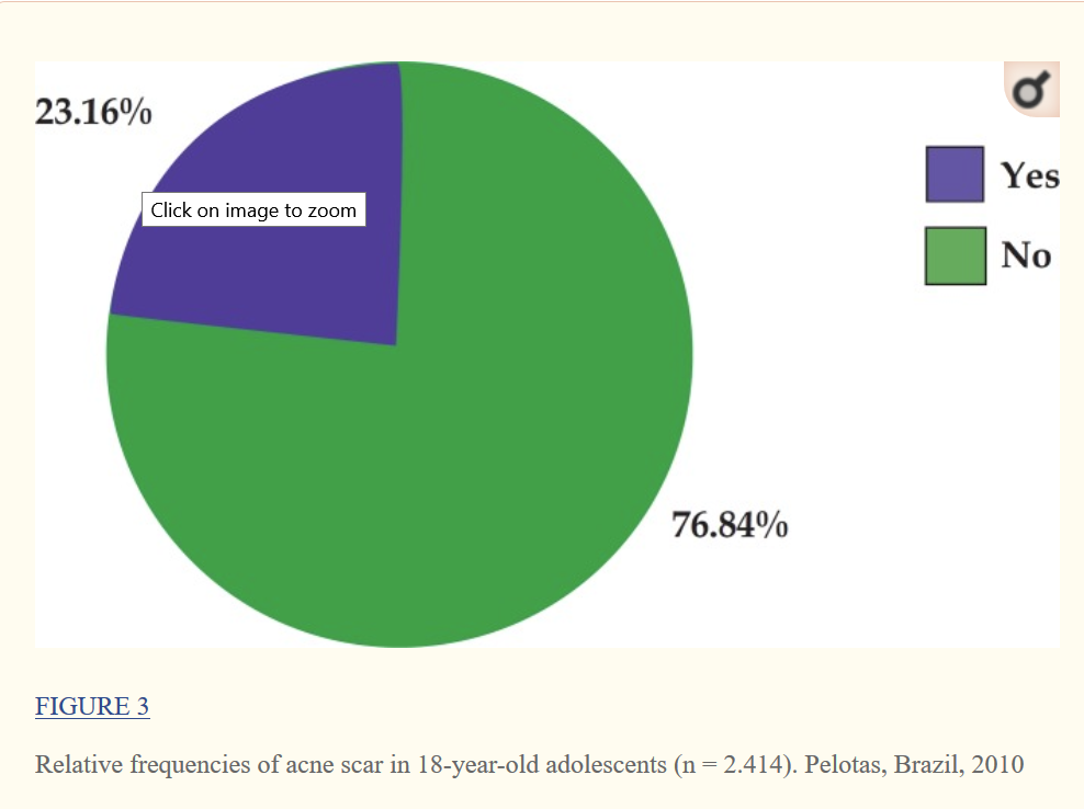
If the results add up to 100% as they do for the acne case, they can also be shown in a pie chart. The frequency table, histogram and pie chart all present the same information, so pick one or the other.
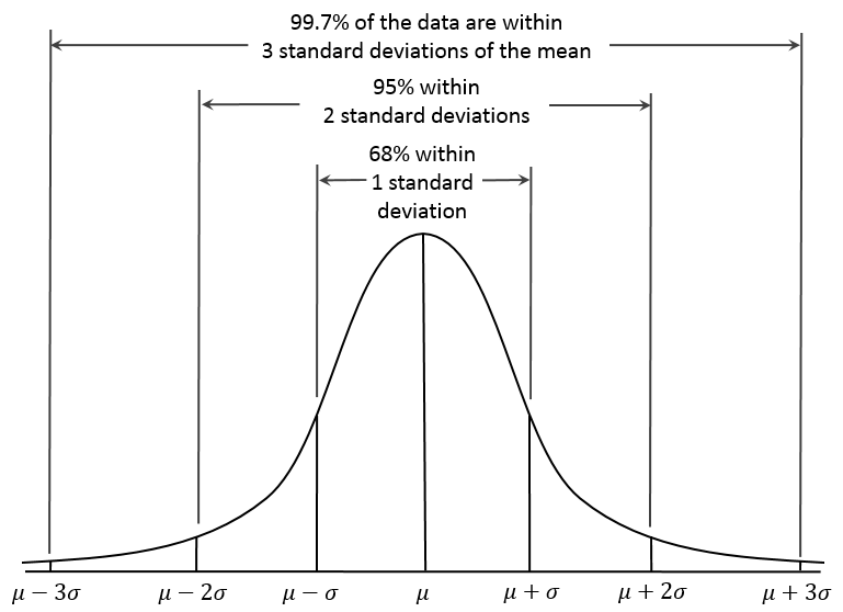
The normal distribution. The distribution of a set of scores shows how often each value occurs, as the histogram above does for its categories. For interval data, statistics idealizes population data as an ideal distribution, e.g. the normal distribution or bell-shaped curve is the distribution that describes say height, where most people are about average height while a few are in the distribution “tails”, i.e. very short or very tall. Every normal distribution has a mean center point and a standard deviation that defines how spread out it is. For normal distributions, 68% of scores are within one standard deviation of the mean, 95% of scores are within two standard deviations and 99% of the scores are within three standard deviations. Since statistics tells us that a population sample should be normal, one can estimate the probability that a mean came from a given population, e.g. if a sample of heights from a village averages three standard deviations higher than normal we say they are significantly taller, as in only 1% of cases will this occur by chance. The next section covers significance in more detail.