Interactions. For interactions between variables the analysis becomes more complex, as it depends on the data types interacting. One can simply describe the interaction by tables or graphs or calculate a statistic on the interaction. The simplest form of interaction statistic is a correlation.
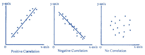
Correlations. A correlation is when two variables change together and so associate in some way. The correlation can be:
- Positive. The variables increase and decrease together.
- Negative. When one variable increases the other decreases and vice-versa.
- No correlation. The variables vary randomly with respect to each other.
The scattergram graphs show these three options. Two key properties of any correlation are strength and significance.
Strength. The strength of a correlation is how much the two variables vary together. The statistic calculated to measure strength depends on variable type:
- Both categorical. Phi or Lambda.
- Both ordinal. Gamma.
- Categorical variable and interval variable. Eta.
- Both interval. Pearson’s correlation coefficient, r.
Squaring a correlation coefficient is interpreted as the percentage of variance shared, e. g. if r = 0.5 then the interaction explains 25% of the variance. Likewise, Eta squared gives the proportion of variance explained or shared. In general, r <0.10 is considered a small effect, r > 0.30 is considered a medium effect and r > 0.50 is considered a large effect. Calculate appropriate statistics to measure interaction strength.
Significance. Significance is how likely an interaction occurred by chance, measured as a probability (p), e. g. p < .05 means there is less than a 5% probability the results are random chance. The significance statistic to use depends on data type:
- Two interval or ordinal data sets. Use t-test.
- Two categorical variables. Use Chi-squared.
- Dichotomous variable and interval data. Use t-test.
- More than two categories and interval data. Analysis of Variance (ANOVA) F-test.
Calculate appropriate statistics to measure interaction significance.
Strength and significance are different. An interaction may be weak but significant, or strong but not significant, depending on the number of subjects:
- For many subjects: A correlation of strength r = 0.30 that only explains 9% of the common variance may still be significant at p < 0.01, as only 1 of 100 such results are by chance. The correlation is significant but weak.
- For a few subjects: A correlation may be insignificant but strong, e. g. r = 0.86 is a strong correlation but p = 0.06 is not a significant result.
It is not enough to just describe an effect, e.g. a study of the effect of optimism on health reports: “The optimists in the study were found to have better blood sugar and cholesterol levels than their more negative counterparts.” Readers want to know if the differences were significant and how strong they were. In such studies, while the results are significant due to many subjects, the effect is weak to moderate, i.e. r is between about 0.1 and 0.3. This just means that while optimism probably does affect health, there are many other factors, see here.
Assumptions. Any statistical analysis has assumptions that must be stated, e. g. the F-test statistic assumes normally distributed responses, similar variances (homogeneity), and independent errors. Such assumptions must be tested, e.g. the Kolgorov-Smirnov test for normality. An assumption of significance tests is that they are limited, as if one does 100 tests it is expected that one of them will be p<0.01. One cannot “fish” into data with potentially hundreds of correlations to pull out a few that are “significant” unless they were predicted in advance. To avoid data mining, decide the tests in advance based on the literature review or divide the probabilities by the number of tests. State and justify analysis assumptions.
Cross–tabulations. Cross-tabulations are frequency tables that show more than one categorical variable. Each cross-tabulation cell shows a frequency or percentage. For simplicity, usually only row percentages are shown, so the row percentages add up to 100%. If the table is showing a causal relation, make each row one causal value, e. g. if the causal variable is gender, one row will be male and one row female, and the columns show the effect, which for health might be say Low, Medium and High. The reader can then look how health changes from one row to the next, i.e. how the dependent variable depends on the independent variable. Cross-tabulations generally show percentages that add up to 100% across each row.
Result tables. If an interval dependent variable is shown in a table, it does not appear as a row or column heading; Each cell gives a score for the dependent variable, which can be imagined as a dimension coming out of the page. If a results table has both row and column there are two causal variables, while for a frequency table the rows are the causal variable and the columns the dependent variable. Result tables show the dependent variable as a cell result that varies by row and column values.
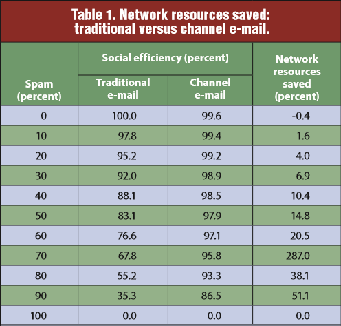
For example, this results table shows three variables:
- E-mail spam amount, in the rows from 0 to 100%.
- E-mail type, heading the middle two columns, either traditional email or channel email.
- Social efficiency, the percentage of socially useful bytes shown as the middle column cell values.
The paper argues that channel email is better, with e-mail type the independent variable, social efficiency the dependent variable and spam amount a control variable. The fourth column just summarizes the effect, as network resources saved. Note that social efficiency is a result percentage not a frequency, so one must imagine the third variable as coming up out of the page.
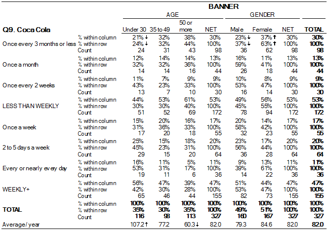
In contrast, this frequency table shows Cola Preference by Age and Gender, which is also three variables, namely how age and gender may affect preference. It is more complex because all the variables are rows or columns. When viewing a table, distinguish frequency vs. result tables to see the variables correctly.