Limitations. Limitations are possible flaws in the research including any necessary assumptions that were made. It is always better to declare limitations than to try to hide them, e. g. if the sample is small, state that as a limitation. Science accepts that limitations are normal in research, e.g. the limitations of a mathematical theory are called axioms and mathematics advances by declaring rather than hiding them. In general, a “fool–proof” argument is just one whose premises are undeclared. Every study has limitations and stating them suggests how others can improve on what was done, i.e. future research. It is also better to discuss limitations than to let them arise in a reviewer’s mind. Knowledgeable readers see the limitations anyway and wonder why you did not mention them. Declare and discuss any research limitations
Future research. Help the research community by suggesting how others could build on this work in the future. A large oak tree may arise from a little acorn so feel free to imagine future possibilities or outcomes. Remember that many things that once seemed unlikely have actually occurred, e. g. the Internet. Having directly experienced your research, you are well placed to advise others who follow, so do so. Having returned from a journey, tell others who go the same way what to avoid and what might be worth looking at next time. Discuss the future research that this research suggests.
Conclusions. Conclusions are general statements about the findings that pull the paper together by linking to earlier sections. Findings are directly from the results but conclusions have a broader context, e.g. the Michelson-Morley experiment that transformed physics found that the speed of light was the same in every direction but concluded that there was no aether that mediated all movement. The finding followed directly from the experiment but their conclusion addressed the theory of the time. Likewise Hubble’s finding that all galaxies are speeding away from the earth in proportion to their distance led to the conclusion that the universe began from a “big bang” at a single point. This conclusion was derived from the finding based on theory. Keeping data findings separate from theory conclusions is helpful, as it lets others agree with findings but not the conclusions drawn from them, so they can interpret the same findings in a different way. Research is not simply going out and collecting information. One must also discuss whether the results differed from what one might expect based on current theory. Draw conclusions from the findings and relate to the theory context.
Implications. Implications are what the research suggests for other theories. It is not enough to simply state conclusions – you must position them with respect to other theories. Does the conclusions challenge, support or suggest modifications to current theory? Relate conclusions to other theories one at a time and in as much detail as needed. Relating your research to important theories also makes it relevant to readers who know about them. Yet while a conclusion may be firm, implications are often harder to see, e.g. after physics concluded that the universe began at a single point, it took a while to realize the implication that space itself was expanding. Discuss the implications of the research for other theories.
Recommendations. Recommendations are proposals for practical action. Based on the implications of the research it may be appropriate to recommend some form of action, e.g. a clinical trial may recommend use or non-use of a drug. One should recommend with caution but in risk/opportunity terms, to not recommend action to prevent harm is to miss an opportunity. Morally, one is as culpable for what one didn’t do to prevent harm as what one did do to cause harm. To illustrate the difference between the above terms, a climate change research finding that arctic ice is melting may generalize to the implication that sea levels will rise world-wide, giving the recommendation that low-lying cities prepare to handle flooding.
Findings. Findings follow directly from the specific data and are not general conclusions. Each finding must be argued directly from the data. If the literature review set up hypotheses, go through them one at a time stating whether the data support or does not support each one. Argue all findings individually and directly from the data.
Findings are not conclusions. Note that a finding is just what is found, not a conclusion. Don’t discuss why the results happened or speculate on what they mean. It is left to the discussion section to apply theory to the findings and form conclusions. Don’t speculate in the results section.
Summarize all findings. Finally, at the end of the results section, summarize all findings as a numbered or bulleted list of single statements. Though the findings have been argued individually earlier, a list brings them together at one point and it helps the reader to see them all in one place. Summarize all findings in a list or table at the end.
Causality. Years ago, scientists reported that peanuts caused cancer so my dad immediately gave them up for the rest of his life, yet nuts are now seen as healthy. How can a science based on facts get things like that wrong? The answer is by seeing causality that is not so. If facts are the data we measure, then causality isn’t a fact because we infer rather than see it directly, e.g. Newton saw gravity as a force from the earth pulling the apple down, but no-one ever saw gravity so it wasn’t a “fact”. This is why Einstein could later show that masses don’t emit forces but just change the space and time around them. Causes are not facts but inferred from facts, so are easy to get wrong. A common error is to infer causation from correlation.
Do storks deliver babies?
Correlation is not causation. Folklore shows pictures of storks delivering babies but a study has shown that the correlation between the number of storks and the number of babies delivered is a strong 0.62 and very significant at p < 0.01. So do storks deliver babies? Equally there is a correlation between number of ice-creams consumed and number of drownings, so does eating ice-cream cause drownings? In both cases, the correlation arises not because one causes another but because a third thing causes both. Storks correlate with babies because the weather makes both go up and down together. Likewise ice cream correlates with drownings because in the summer swimming and eating ice cream go up and in the winter both go down, giving a spurious correlation. To understand this, explain why that the shoe size of children correlates with mathematics ability doesn’t mean you should buy your child bigger shoes!
Spoiler
Shoe size correlates with maths due to a third variable of growth: as children get bigger they get bigger shoes and also get better at mathematics.
Correlation logic. In logic, that one thing causes another can be written X→Y and that the two correlate can be written X~Y. Correlation then does not mean causation because that X~Y could mean that:
X causes Y: X→Y, or
Y causes X: Y→X, or
A third variable Z causes both: Z→X and Z→Y.
So in the stork case, X=Number of storks, Y=Number of babies and Z= Weather. Another example is the correlation between the number of violent movies watched by teenagers and their tendency to violence. One can infer that watching violent movies causes violence but it is equally likely that violent teenagers prefer violent movies, i.e. that the causation works the other way. If you think science is immune to such errors, think again. Studies showing that women on hormone replacement therapy had a lower coronary heart disease led doctors to conclude it was protective until controlled studies found no such effect. They got the causality backwards – it wasn’t hormone therapy making the women healthier but that women from higher socio-economic groups with better-than-average diet and exercise regimens could afford the therapy. The point is important because research in areas such as health and marketing are full of causal inferences made from correlational data.
Science and causation. To the statement that correlation is not causation it must be added that no degree of significance ever establishes causation. Significance only tells that the result is not random, not what causes what. To show causality, science must not just look at data but also manipulate it. The experimental method holds everything else constant then manipulates the proposed cause, so it is the research design that establishes causality, not the statistics. Rather than just observing a cause, one changes it to see the effect, i.e. by acting not just looking. If this is impossible, one needs a known mechanism, e.g. research linking smoking to cancer is correlational as it is unacceptable to raise one group of babies with cigarettes and another without! Causality is inferred because smoke is known to be carcinogenic.
Progressing to causality. Research methods can be seen as progress to causality:
Discovery. Methods like grounded theory discover important constructs.
Causality. Experiments manipulate constructs to show causality.
Thus the different methods of science are complementary not in competition.
Error types. The two types of error are false positives and false negatives. The worst result in research is not “negative” data that contradicts a theory but data that shows nothing at all, or nil results. Nil results are random data that has no meaning or value. Perhaps the literature review badly defined constructs, or confounded two effects that cancelled out, or measurement error “noise” drowned out an effect. And even if results are obtained they may be in error. Research error comes in two types:
Type I error. Type I error is a false positive result. It is an error of commission.
Type II error. Type II error is a false negative result. It is an error of omission.
False positives occur when research doesn’t have enough rigor. Research rigor includes reliable and valid measures, a bias-free method and correct analysis including testing any assumptions. It ensure that any result found is unlikely to be random or due to causes other than those proposed. Research must be rigorous enough to avoid false results.
False negatives occur when research does not have enough sensitivity. Improve research sensitivity by methods that enhance responses, e. g. motivate subjects to be honest, reduce subject error, e.g. subject training, or more sensitive statistical tests. Research must be sensitive enough to register results.
Reducing one error type tends to increase the other. Research is often a trade-off between rigor and sensitivity, as too much rigor results in not finding real effects and too much sensitivity results in finding false effects. It is like in life, where taking every precaution to avoid danger gives missed opportunities, and taking every opportunity gives more danger. In general, reducing false positives to zero increases false negatives to 100% and vice-versa.
Interactions. For interactions between variables the analysis becomes more complex, as it depends on the data types interacting. One can simply describe the interaction by tables or graphs or calculate a statistic on the interaction. The simplest form of interaction statistic is a correlation.
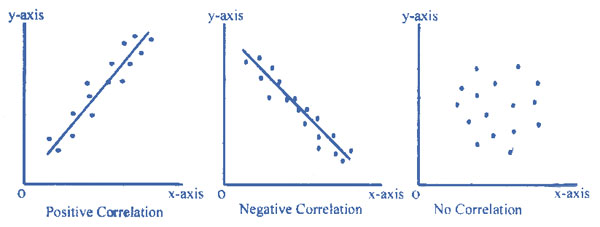
Positive, negative and no correlation from emathzone.
Correlations. A correlation is when two variables change together and so associate in some way. The correlation can be:
Positive. The variables increase and decrease together.
Negative. When one variable increases the other decreases and vice-versa.
No correlation. The variables vary randomly with respect to each other.
The scattergram graphs show these three options. Two key properties of any correlation are strength and significance.
Strength. The strength of a correlation is how much the two variables vary together. The statistic calculated to measure strength depends on variable type:
Both categorical. Phi or Lambda.
Both ordinal. Gamma.
Categorical variable and interval variable. Eta.
Both interval. Pearson’s correlation coefficient, r.
Squaring a correlation coefficient is interpreted as the percentage of variance shared, e. g. if r = 0.5 then the interaction explains 25% of the variance. Likewise, Eta squared gives the proportion of variance explained or shared. In general, r <0.10 is considered a small effect, r > 0.30 is considered a medium effect and r > 0.50 is considered a large effect. Calculate appropriate statistics to measure interaction strength.
Significance. Significance is how likely an interaction occurred by chance, measured as a probability (p), e. g. p < .05 means there is less than a 5% probability the results are random chance. The significance statistic to use depends on data type:
Two interval or ordinal data sets. Use t-test.
Two categorical variables. Use Chi-squared.
Dichotomous variable and interval data. Use t-test.
More than two categories and interval data. Analysis of Variance (ANOVA) F-test.
Calculate appropriate statistics to measure interaction significance.
Strength and significance are different. An interaction may be weak but significant, or strong but not significant, depending on the number of subjects:
For many subjects: A correlation of strength r = 0.30 that only explains 9% of the common variance may still be significant at p < 0.01, as only 1 of 100 such results are by chance. The correlation is significant but weak.
For a few subjects: A correlation may be insignificant but strong, e. g. r = 0.86 is a strong correlation but p = 0.06 is not a significant result.
It is not enough to just describe an effect, e.g. a study of the effect of optimism on health reports: “The optimists in the study were found to have better blood sugar and cholesterol levels than their more negative counterparts.” Readers want to know if the differences were significant and how strong they were. In such studies, while the results are significant due to many subjects, the effect is weak to moderate, i.e. r is between about 0.1 and 0.3. This just means that while optimism probably does affect health, there are many other factors, see here.
Assumptions. Any statistical analysis has assumptions that must be stated, e. g. the F-test statistic assumes normally distributed responses, similar variances (homogeneity), and independent errors. Such assumptions must be tested, e.g. the Kolgorov-Smirnov test for normality. An assumption of significance tests is that they are limited, as if one does 100 tests it is expected that one of them will be p<0.01. One cannot “fish” into data with potentially hundreds of correlations to pull out a few that are “significant” unless they were predicted in advance. To avoid data mining, decide the testsin advance based on the literature review or divide the probabilities by the number of tests.State and justify analysis assumptions.
Cross–tabulations. Cross-tabulations are frequency tables that show more than one categorical variable. Each cross-tabulation cell shows a frequency or percentage. For simplicity, usually only row percentages are shown, so the row percentages add up to 100%. If the table is showing a causal relation, make each row one causal value, e. g. if the causal variable is gender, one row will be male and one row female, and the columns show the effect, which for health might be say Low, Medium and High. The reader can then look how health changes from one row to the next, i.e. how the dependent variable depends on the independent variable. Cross-tabulations generally show percentages that add up to 100% across each row.
Result tables. If an interval dependent variable is shown in a table, it does not appear as a row or column heading; Each cell gives a score for the dependent variable, which can be imagined as a dimension coming out of the page. If a results table has both row and column there are two causal variables, while for a frequency table the rows are the causal variable and the columns the dependent variable. Result tables show the dependent variable as a cell result that varies by row and column values.
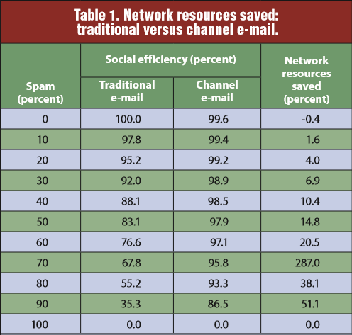
From Channel Email 2009, p66
For example, this results table shows three variables:
E-mail spam amount, in the rows from 0 to 100%.
E-mail type, heading the middle two columns, either traditional email or channel email.
Social efficiency, the percentage of socially useful bytes shown as the middle column cell values.
The paper argues that channel email is better, with e-mail type the independent variable, social efficiency the dependent variable and spam amount a control variable. The fourth column just summarizes the effect, as network resources saved. Note that social efficiency is a result percentage not a frequency, so one must imagine the third variable as coming up out of the page.
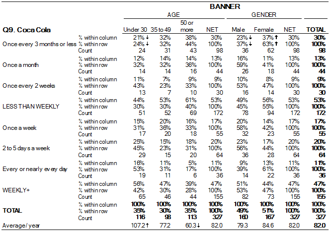
In contrast, this frequency table shows Cola Preference by Age and Gender, which is also three variables, namely how age and gender may affect preference. It is more complex because all the variables are rows or columns. When viewing a table, distinguish frequency vs. result tables to see the variables correctly.
Describe basic results. Begin the analysis with what is easy to understand rather than hard. First describe the data overall, for example a paper that says the study:
“… generated 54 raw data files (3 sets with 18 groups), giving 1,512 result records (12 questions by 18 groups for 7 vote sets), each involving five people in 2 decisions (vote and confidence). There were 12 missing values (one person missed a third vote) so some ANOVA calculations involved only 17 groups. The complete experiment involved over 15,000 individual vote decisions. Of the 4320 first and second votes, only 89 (or 2.1%) were Don’t know.” Generating Agreement in Computer-mediated Groups, p13.
Describe the sample. Next describe the sample demographics, e. g. males vs. females, age etc. and compare with the population of interest to show how the sample represents the population. Even if the sample is only one person, answer the question “Was that person typical?” Giving subject demographics indicates what group the research applies to. Students don’t always represent the general population but one can argue that they do:
“The subjects were 28 students enrolled in an undergraduate Management Information Systems evening course, with 65% males and 35% females. They were a culturally diverse group, and most also worked full time. Subjects on average had used browsers for 7.75 years, and spent over 26 hours per week using them, so were experienced browser users.” Expanding the Criteria for Evaluating Socio-Technical Software, p 10.
Compare sample demographics to the research population.
Describe single construct results. Describe single construct results before moving on to interactions, based on data type:
Qualitative: Describe the themes found with selected text quotes.
Quantitative: Quantitative results can be described by just three numbers:
1. Frequency. The number of values.
2. Central tendency. The datacenter point.
3. Dispersion. The dataspread.
Again these depend on data type:
Categorical. Break down the number in each category in a frequency table with percentages that add to 100%. The center point is the mode – the most frequent category. Dispersion doesn’t apply to category data.
Ordinal. For number again use a frequency table. The center point is the median – the middle rank if you lay all the points out in a line. The dispersion is the range, the minimum-maximum difference.
Interval. Interval scores can be summarized by three descriptive numbers: frequency N, mean µ, and standard deviation σ.
Use tables and graphs to describe data depending on type, or simply state the results in the text.
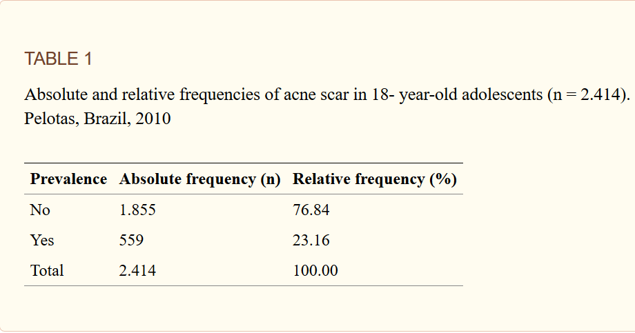
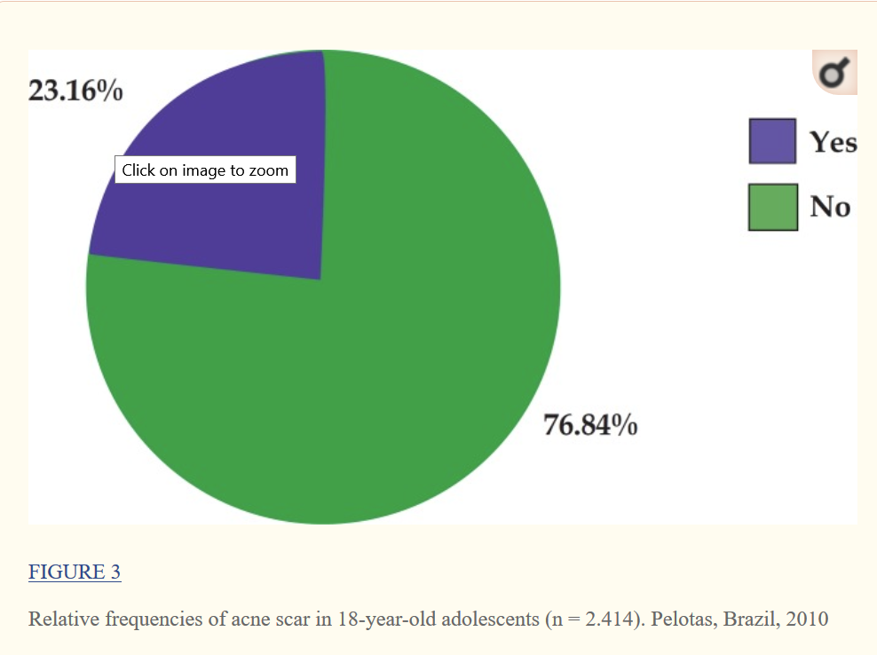
Frequency tables. A frequency table shows numbers and/or percentages that show the frequency distribution of one or more variables. All tables need a table number and a title at the top. Tables must be referenced in the main text, e. g. “See Table 1”. The example shows the frequency of acne in 2,414 subjects as a frequency and a percentage. Give tables a meaningful title, e. g. “Usage by Experience” not a meaningless title like “Data results”. Row and column labels should clearly describe what the rows and columns are. If you present a table, be sure to comment on what it means in the text.Tables need a useful title, row/column labels and a description in the text.
A result table
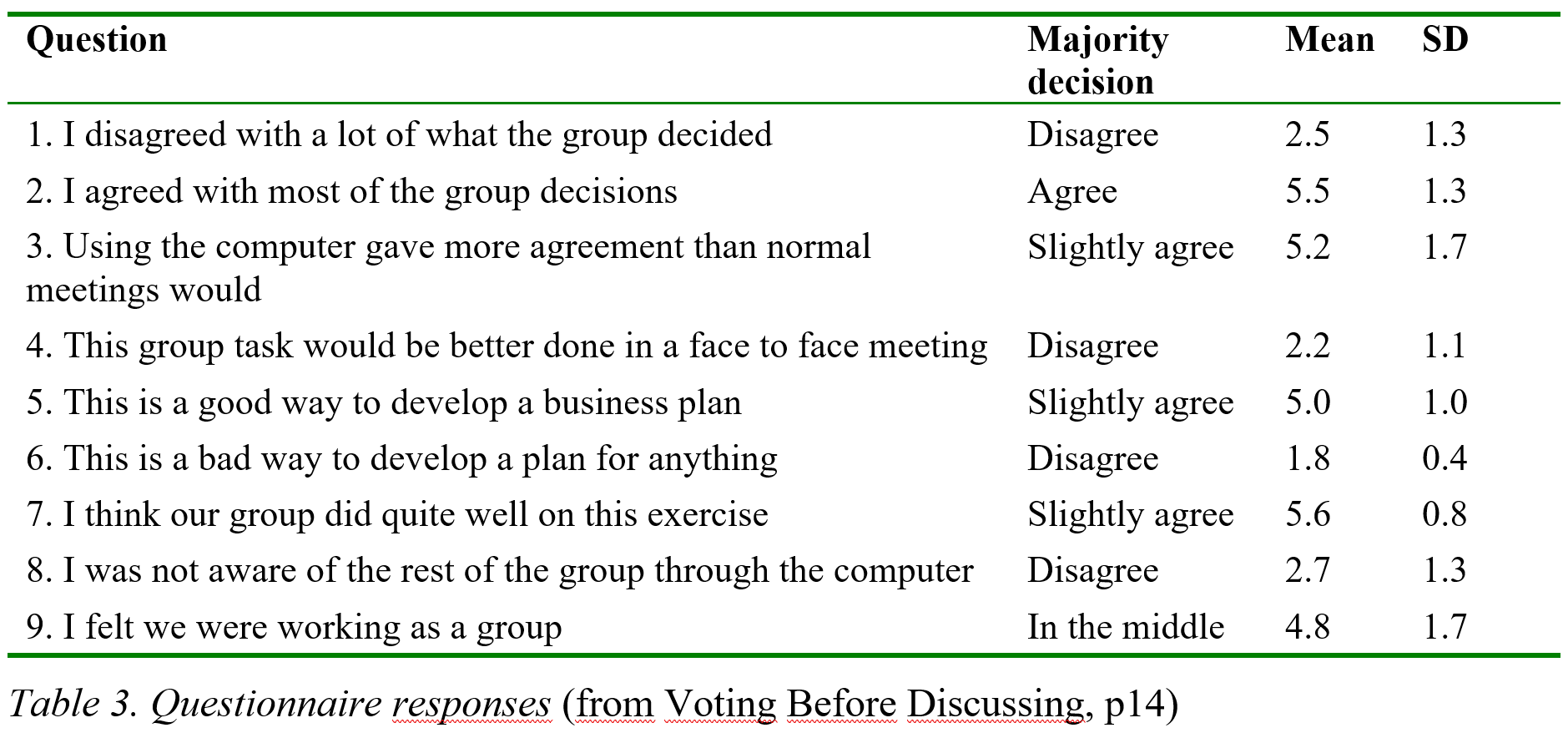
Result tables. Result tables give results like mean and standard deviation broken down by one or more variables. The table shown does this for a 1-7 response scale for nine questions and also gives the majority decision for clarity. In the table, round off data appropriately to the error, e. g. if the data is accurate to two decimal places, give 3.74 not 3.742356, even if the statistics package gives 3.742356. Round off data in result tables appropriately to the error.
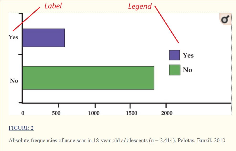
Graphs. Graphs present numeric data in picture form. For example, the acne study results given earlier can be presented as a histogram, a frequency table in picture form. Like tables, graphs need a figure number and a relevant title that is referred to in the text, except the title now appears below the figure. They also have labels to describe what each value represents, or a floating legend to do the same.
Histogram with many values
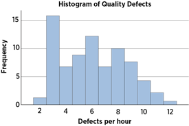
If there are more than two values, the histogram usually shows them along a horizontal axis. The vertical axis is the frequency, i.e. the number of times that score occurred.
If the results add up to 100% as they do for the acne case, they can also be shown in a pie chart. The frequency table, histogram and pie chart all present the same information, so pick one or the other.
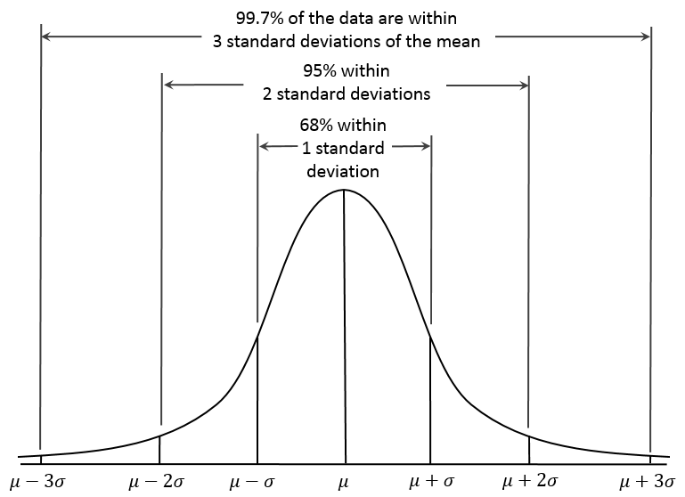
The normal distribution. The distribution of a set of scores shows how often each value occurs, as the histogram above does for its categories. For interval data, statistics idealizespopulation data as an ideal distribution, e.g. the normal distribution or bell-shaped curve is the distribution that describes say height, where most people are about average height while a few are in the distribution “tails”, i.e. very short or very tall. Every normal distribution has a mean center point and a standard deviation that defines how spread out it is. For normal distributions, 68% of scores are within one standard deviation of the mean, 95% of scoresare within two standard deviations and 99% of the scores are within three standard deviations. Since statistics tells us that a population sample should be normal, one can estimate the probability that a mean came from a given population, e.g. if a sample of heights from a village averages three standard deviations higher than normal we say they are significantly taller, as in only 1% of cases will this occur by chance. The next section covers significance in more detail.
Data type. The raw data the method produces is analyzed in the results section. The analysis done depends on the data type, which can be qualitative or quantitative. Qualitative data requires human interpretation, e.g. an interview record. Qualitative analyses include Content analysis, Narrative analysis, Discourse and Framework analysis, and Hermeneutics. Quantitative data in contrast is numeric, so statistics can be used. The statistics available depend on whether the data is:
Categorical. A set of values with no particular order, e.g. PC, Laptop, Tablet, Handheld.
Ordinal. A set of values with a rank order, e.g. income levels of Low, Medium and High.
Interval. A set of numbers where the interval between each consecutive point of measurement is equal to every other. The values can be discrete, e.g. number of children, or continuous, e.g. time of day, 1pm, 2pm etc.
Ratio. A set of interval numbers that have a zero point, e.g. height.
The data type affects the amount of information, e.g. measuring job experience in years gives more information than self-ratings of Expert, Competent or Novice but the latter may have more validity as years doesn’t always make an expert. Note one can convert interval data to ordinal, e.g. call 1-3 years Novice, 3+ to 6 years Competent and 6+ years Expert, but not vice-versa. In general, one can always convert more information to less but not vice-versa. Analyze data according to data type.
Data conversion. Data conversion turns raw data into the base data set that gives the findings. It can take some time, e.g. transcribing an interview audio into text. Only collect the raw data you need, e.g. don’t record an interview on video unless you are doing a video analysis. Data conversion raises two issues:
Missing data. If parts of an audio are unclear or a questionnaire wasn’t answered that is missing data. Research doesn’t throw information away so missing data is recorded. Record different types of missing data differently, e.g. an unclear audio section is coded differently from a recording failure, and not answering a question at all is coded differently from ticking a Don’t Know box. If missing values are coded as 0 and 9, these values are excluded from any calculations.
Outliers. An outlier is a data value that is significantly different from all the others. If attributed to an equipment failure it may be removed but in large data sets outliers are expected, e.g. some people are in fact eight feet tall.
Briefly state how raw data was converted and how missing values were handled.
Questionnaires. Developing questionnaires is a field in itself, if not an art. See market research for a detailed guide. Yet almost any research that involves people can benefit from questionnaires that are:
Exploratory. A pre-study questionnaire can discover what concern people.
Interpretive. A post-study questionnaire can help interpret numeric data.
Key aspects of any questionnaire are its purpose, validity and reliability, questions and responses.
Purpose. Define the questionnaire purpose in advance based on the literature review and research question, i.e. what data do you want to obtain? Then focus on what is important and leave out the rest. People are more likely to finish a short and sweet survey of say 10-20 questions, while too many questions and they just “tick boxes” to get it over with. If the purpose defines a dependent variable don’t forget it, e.g. for research on why people leave a job ask how long they expect to stay in it, as you will correlate all the other reasons for leaving with that.
Validity and reliability. In questionnaires, a valid question is one that measures what you think it does, and a reliable question is one that gives the same results if asked again. Since almost every question has probably been asked before, why re-invent the wheel? Use previous questions with already established validity and reliability if possible, as this also allows cross-study comparisons.
Introduction. The introduction gives the context of the questionnaire, such as who is behind it, why it is important, how long it will take and what the subject gets out of it, if anything. Give time to this, as if subjects don’t answer the questions properly the results will be poor. The introduction is just as important as the questions themselves. Consider giving some minor gift, such as a lottery for free tickets donated by a sponsor, to show commitment. This doesn’t bias the sample as everyone likes a bonus, but check with your ethics committee first. At the very least, offer the reward of them seeing the results somehow.
Question. Good questions engage and are:
Understandable. Not understanding a question and answering it anyway adds error variance to the results. e. g. “Do you own a tablet computer?” may not be understood by those who don’t know what a tablet computer is. Use simple, clear language with no jargon.
Unambiguous. Ambiguous questions can be interpreted different ways, e.g.“Do you enjoy and benefit from this web site?” when one might benefit but not enjoy it. Split double-barrelled questions into two questions.
Unbiased. A biased question implies an answer, e.g. the leading question “Do you prefer healthy foods?” is biased because it suggests the agree answer. Rephrase in an impartial way, e.g. “List 10 foods you eat often”. Equally loaded questions presume an answer that might not apply, e.g. “Why do you drink beer?” is biased because it assumes that all people drink beer.
Answerable. Only ask questions a person can be expected to answer to, e. g. “How good is the national budget?” is not something most of us know.
Inoffensive. Using taboo or offensive words may cause a subject to refuse to answer, e. g. “When did you last have sex?” may be inappropriate it some cultures.
Questions that are unclear, ambiguous or ask what isn’t know give error variance, i.e. unreliable data. Questions that are biased or offensive are invalid, e.g. offensive questions often result in missing values. Avoid overly complex questions, e.g. an e-business study asked subject to rate the statement “Our company has e-business applications that are capable of handling significant growth in a number of transactions, customers or employees”. It is hard to understand, as what is “significant” growth” and “a number”? It is also ambiguous as my my company might have good apps for employees but nothing at all for customers or transactions? Check that questions are understandable, unambiguous, unbiased and answerable.
Responses. Question responses can be:
Open. Respondents answer in their own words. Open responses can give more information but are harder to analyze.
Closed. Respondents select from a fixed set of answer choices. Closed responses are easier to analyze but harder to design well.
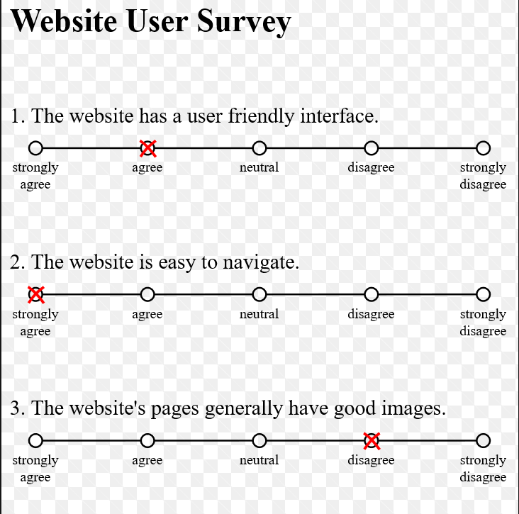
A Likert Scale
For closed responses, or multi-choice questions, the response scales should be:
Understandable.It is obvious what the options mean.Often it is best to individually label each option, as in a 1-5 Likert Scale.
Unbiased. The choices do not imply a preferred answer. Avoid value laden labels like “better” or “worse”.
Exhaustive. Options that are collectively exhaustive cover all possible answers.
Exclusive. Options that are mutually exclusive don’t overlap.
Sensitive. The choices produce varied user responses.
For example, consider the question “How long have you been at your job?”
Less than one year
1-2 years
3-4 years
More than 4 years
Don’t know
Is this exclusive and exhaustive? It is not exhaustive because it doesn’t cover those who have worked more than two but less than three years. Now consider the question “How long have you been at your job?”
Less than one year
1-2 years
2-3 years
3-4 years
More than 4 years
Don’t know
This isn’t exclusive as those who have worked two years have two response options not one. Since some will take one option and some the other, this error variance weakens the results. Design response scales to be understandable, unbiased, exhaustive, exclusive and sensitive
Sensitivity. A questionnaire fails if the result is just random error variance, but it also fails if the result is no variance at all, e.g. for the following Likert scale response:
Strongly disagree
Disagree
In the middle
Agree
Strongly agree
If everyone chooses In the middle then the question gives no information at all and so is worthless! One can increase the sensitivity of the response scale by making it:
Strongly disagree
Disagree
Slightly disagree
In the middle
Slightly agree
Agree
Strongly agree
This spreads the response out more to get more value. Increasing the options gives more information but only up to about seven, after which sensitivity increase little. Pilot questions to ensure they are sensitive.
Missing values. When people encounter a question they don’t understand, can’t answer or don’t want to answer, they either tick any box or just leave it out. Both are undesirable. It is better to manage such cases by giving options like Don’t Know or Not Applicable.
Research design. The research design is the logic by which the results answer the research question, e.g. suppose one is studying whether regular use of pain–killers harms people, given the current US opioid crisis. A simple approach might be to interview people in hospitals to find out whether they are on pain–killers and measure their state of health. If the results were that those on painkillers were less healthy than those not on painkillers, does this mean that pain–killers reduce health? Unfortunately, the research design only shows a correlation, not what causes what. Indeed, as sicker people are more likely to need pain–killers it may be that sickness is causing pain–killer use, not the other way around. Such problems are common in research, so the research design aspect of the method states the logic by which the results will answer the research question. Stating the research design logic may only take a sentence or two but is very important. Before doing your research, imagine it gives ideal results and ask yourself “Does this really answer the research question?”
Experiments that seek to establish causes must be especially clear about research design. The basic logic of an experiment is to assign subjects to treatments to see what causes what. The treatment is the independent variable that the experimenter applies and the result is the dependent variable that is measured. This logic assumes that subject cases are applied to treatments in a random and matched way, so in a study of how people rate different browsers, they can’t choose the browser they rate as that is not random, nor is it matched, as more people would choose popular than unpopular browsers. This introduces their choice as a spurious cause of browser preference, and differences found could be attributed to subject differences not the treatment. This issue gives these types of experiment:
Experimental design. Subjects are randomly assigned to all treatments.
Quasi-experimental design. Subjects are randomly assigned to some treatments, e. g. if one cause is male-female gender, subjects cannot be assigned randomly.
Repeated measure design. Subjects try first one treatment then another, e. g. try one browser then another. Since all subjects do all treatments, there is no need for random assignment and the subjects are the same for all trials. However there can be order effects, so the order that subjects try the software must be randomized to avoid it affecting the results.
Choosing a design. Discuss the research design with your advisor before proceeding, and once you select a design, read up on it in more detail. Some common designs are:
One-shot case study or ex post facto design. A single group of subjects is measured after some intervention, e. g. studying the effect of new security measures. The problem here is that even if subjects liked the new measures, perhaps they equally liked the old ones?
Two-group post-test only without random assignment. In this static (one-time) design, a group without the intervention is also measured, e. g. smokers are compared to non-smokers for health effects. The problem here is that people with weak health initially may be precisely those who choose smoke, e.g. soldiers about to enter battle may smoke as they figure they won’t last long anyway but smoking didn’t cause their death.
One-group pretest-posttest. A single group of subjects is measured before and after some intervention, e. g. measure health before and after a diet. The problem here is that other factors may operate over that time, e.g. the World Cup may be on causing many subjects to lose sleep. Who is to say it was diet that caused any effects found?
Two-group pretest-posttest. Subjects are randomly assigned to a treatment group and a control group. Both are measured before and after some intervention, e. g. to assess a new diet, the treatment group will try it while the control group doesn’t. This controls for everything but expectancy bias.
Solomon four-group design. The most complex design as it also controls for experimental bias. Two groups don’t do the pretest, so it takes a lot of work to do.
Control group. The control group is a set of subjects who do everything the same but don’t receive the treatment, e. g. in medical research they get a placebo sugar pill not the new drug. This only controls for spurious causes if the subjects are randomly allocated, so don’t let subjects choose to be in the control group or not. A control group is important if subjects know they are being observed, e. g. in the Hawthorne effect, experimenters found that painting a room a lighter color improved work rate, but later found painting it dark had the same effect! What improved the work rate was not the paint but that they were being observed by researchers. A control group avoids such problems. Randomly allocate subjects to a control group to control for spurious effects.
Bias. Bias is when the research results are determined by what the experimenter does. Science asks a question and gathers evidence to select the answer that is most likely true. When the answer is not chosen by us, the result is the unexpected knowledge that has created the modern age. In contrast when we pick the answer, wittingly or unwittingly, that is bias. Bias stops us learning new things as a cage stops a bird from flying. Bias isn’t just a science error, it is the opposite of science. Biased science isn’t science at all.
Bias and the brain. The human brain can convince itself of anything, e.g. in 2017, over 500 people attended the Flat Earth International Conference to deny that the earth is round. This is not being stupid but choosing what one wants to believe, which everyone has the right to do. Flat Earthers accept that mars is a round planet but not earth, so the answer to Elon Musk’s tweet “Why is there no Flat Mars Society?” is because we live on earth. The brain hasn’t changed much in the last ten thousand years and for most of that time society wasn’t scientific, so large brains didn’t evolve to think scientifically. The intellect began as the servant not the master, until we stopped using it to think backwards and started thinking forward. Society became scientific when it gave its people permission to think freely, see Thinking, Fast and Slow.
Research bias. Research bias, like the random noise in an incoming signal, makes it hard to recognize what is actually there. It can be found at any step of the research journey:
Theory bias. Theory directs research to a desired conclusion, e.g. flat earth theory.
Method bias. Method cherry-picks data to get a desired result, e.g. racial profiling.
Subject bias. Subjects act to confirm what is expected, e.g. the Hawthorne effect.
Analysis bias. Fishing for patterns in results to “fit” a conclusion, e.g. alchemy.
To submit to bias is to let the research voyage of discovery be hijacked for other purposes.
Theory bias. Theory bias is framing the research question to reflect a bias, as in the question “Why do you hate your father?” This is why science doesn’t try to “prove” a theory but to falsify. To be unbiased, one must not own the theory one is testing. Ownership bias occurs when people attach value to things that they own, e.g. a person who will only pay say $2 for a mug might ask $4 if they own it and someone else wants it. It is like the sunk cost bias, where people hang onto a failing stock because they are invested in it. In science, theories are not “can’t lose” possessions but stand or fall by the evidence found.
Method bias. Method bias is when bias controls the method instead of the theory, e.g. in racial profiling, police who only stop black drivers to check for misdemeanorsconfirm their original bias by findingfaults. The law requires random breath testing to avoid this. Confirmation bias is when we choose information that confirms a point of view and ignore that which contradicts it. It gives the social media echo chamber effect, where people accept and pass on false rumors that confirm their prejudices. In science, one cannot cherry-pick evidence to suit a bias but must gather a valid sample before deciding.
Subject bias. Subject bias occurs when subjects are influenced by:
Social effects, e. g. if male researchers get different results from females.
Psychological effects, e. g. if pleasant researchers get different results.
Situational effects. Where “good subjects” try to please the researcher.
Expectancy effects. When expecting an effect produces it.
Science reduces subject bias by:
Double-blind research designs that keep subjects and researchers “blind” to what is expected.
Standardizing the researcher-subject interaction.
Encouraging subject honesty, e.g. ask them to be honest.
Making the research non-threatening, e.g. let subjects be anonymous.
Having more than one researcher.
Analysis bias. Analysis bias occurs when people see patterns in information that are out of touch with reality, e.g. paranoia. As science often advances when people see patterns no-one else sees, geniuses are prone to this bias, e.g. Newton, who founded modern science, spent the last years of his life analyzing bible patterns to decode divine prophecies, including the end of days. Other examples include John Nash, Kurt Gödeland Alexander Grothendieck, one of the greatest mathematicians of the 20th century. Given big data, research must avoid “fishing” for results, and researchers increase significance by the number of tests done to avoid this bias.
Replication. Replication is that independent others can repeat the research. One might think that with all these defenses science would be immune to bias but it is not, as researchers can “tinker” with results or even fabricate them entirely. The last line of defense is replication,e.g. in 1974, a researcher apparently transplanted skin from black mice to white mice, a “breakthrough” that others could not replicate. A later investigation revealed that under pressure to get results, he had painted the white mice with a permanent marker pen, see The Patchwork Mouse. Most researchers are honest, but even so only about a third of studies are replicable for various reasons, including an incomplete report. Replicating research is important, so give a full description of the method used, including copies of any tools like questionnaire, task script or and other instructions. Describe the research method well enough for other researchers to repeat it.
